The Unadorned Wall: Why the Most Confident Design Choice Is Knowing When to Stop
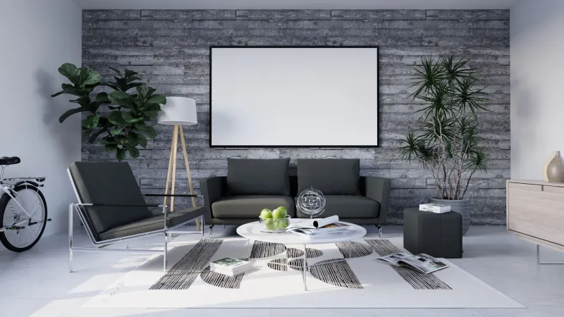
There is a particular pressure that descends the moment a room is nearly complete. The furniture has been placed. The lighting has been layered. The textiles have been chosen with care. And then the eye travels to the wall — long, pale, and empty — and something in the decorator's instinct says: fill it.
This impulse is understandable. American interiors, particularly as curated through social media and shelter magazines, have embraced the gallery wall as a near-universal solution. Framed prints, woven textiles, ceramic wall hangings, mirrors, and sconces cluster together in artful arrangements, transforming blank surfaces into visual narratives. The result is often charming. Occasionally, it is extraordinary.
But not every wall is asking to be spoken to.
Some walls are already doing something. They are holding the light. They are framing a view. They are anchoring a piece of furniture that deserves to stand alone. And when we cover them regardless, we are not decorating with intention — we are decorating out of anxiety.
The Difference Between Empty and Unfinished
The first distinction worth drawing is the one between a wall that is empty and a wall that is unfinished. An unfinished wall reads as neglect — it lacks context, proportion, and relationship to the room around it. An empty wall, by contrast, is one that has been considered and deliberately left clear. The difference lives almost entirely in the confidence of the surrounding decisions.
When the furniture is well-scaled, the lighting is thoughtful, and the room's architecture has been honored rather than obscured, an empty wall ceases to feel like a gap. It becomes a breath. It provides the eye with a place to rest before moving on to the room's true focal points. It communicates, in the most understated way, that the person who designed this space knew precisely what they were doing.
This is not minimalism for minimalism's sake. It is restraint applied with purpose — and restraint, properly exercised, is one of the hallmarks of genuinely elegant design.
What the Empty Wall Actually Does
Negative space in interior design functions much as it does in fine art: it defines and elevates what surrounds it. A painting hung on a wall covered in competing objects loses its authority. The same painting on a clean, unadorned wall commands the room.
But the benefits of an empty wall extend beyond the framing of adjacent art or furniture. Consider what a clear expanse of wall actually contributes:
It reveals the architecture. In older American homes — Craftsman bungalows, colonial revivals, mid-century ranches — the bones of the structure are often the most beautiful thing in the room. Crown molding, picture rails, arched doorways, and coved ceilings all speak more clearly when the walls beneath them are allowed to remain quiet. Covering every surface with objects can inadvertently flatten the very details that give a home its character.
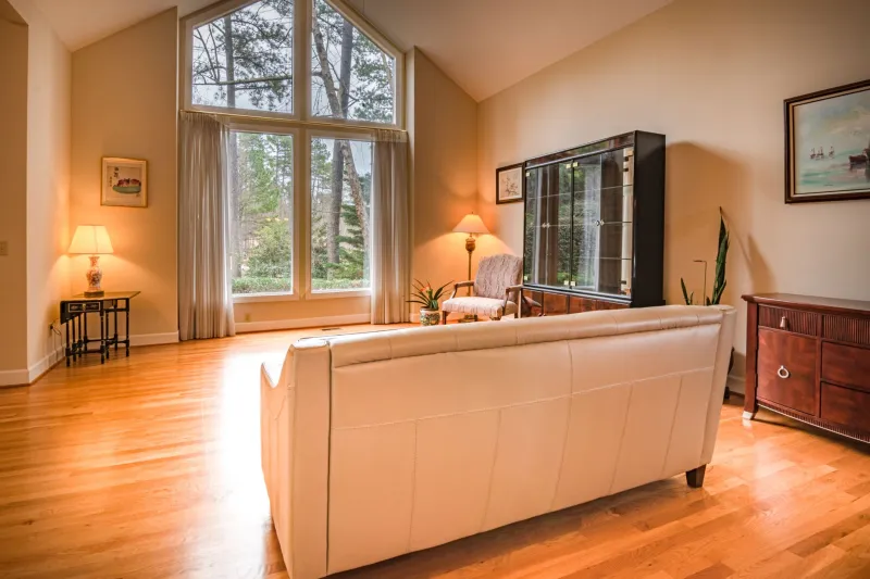
It amplifies light. Natural light moves across a bare wall in a way that no gallery arrangement can replicate. The subtle shift from morning to afternoon, the way a south-facing wall catches the gold of late sun — these effects are only legible on an uninterrupted surface. A room designed around its light deserves walls that honor that design decision.
It draws the eye to what matters. Every room benefits from hierarchy — a clear sense of what the designer intended you to notice first, second, and third. An empty wall does not compete. It recedes, allowing a beautifully upholstered sofa, a sculptural floor lamp, or a single, well-chosen piece of art to hold the prominence it deserves.
It creates psychological calm. This is perhaps the most underestimated function of empty wall space. Rooms that ask the eye to process too much simultaneously produce a low-level visual fatigue that most occupants feel without being able to name. A wall left bare offers relief — a moment of stillness that makes the rest of the room more enjoyable, not less.
The Cultural Habit We Might Reconsider
American decorating culture has long associated a full home with a fulfilled one. The instinct to display — family photographs, collected objects, meaningful prints — is not without warmth or merit. These things tell the story of a life lived, and there is genuine beauty in that.
The question worth asking, however, is whether every story needs to be told on every wall. There is a meaningful difference between curation and accumulation. The home that displays ten objects, each chosen deliberately and placed with care, communicates something quite different from the home that displays one hundred objects simply because the surfaces were available.
Some of the most admired interiors in the country — those that appear in the pages of Architectural Digest or Veranda, or that stop visitors in their tracks — achieve their effect not through abundance but through a kind of ruthless editing. They contain less than you expect, and that restraint is precisely what makes them feel more.
Practicing the Discipline of the Unadorned
For those accustomed to filling walls, the practice of leaving one bare can feel genuinely uncomfortable at first. A few principles may help.
Live with the emptiness before deciding. Before reaching for the hammer and picture hooks, spend two or three weeks with the room as it stands. You may find that the wall you assumed was incomplete is, in fact, already contributing something you had not yet recognized.
Trust the furniture to carry weight. A substantial piece — a tall bookcase, a well-proportioned credenza, a generously scaled headboard — can anchor a wall entirely on its own. The wall above and around it does not need additional decoration to feel resolved.
Consider scale carefully. When the decision is made to add something to a wall, the most common mistake is choosing objects that are too small. A single large-format piece — one artwork, one mirror, one textile — will almost always read as more intentional than a collection of smaller items grouped together.
Allow asymmetry and negative space to coexist. A single element placed off-center on a long wall, with generous empty space on either side, can be more dynamic than a symmetrically arranged gallery. The emptiness becomes part of the composition rather than a problem to be solved.
The Quiet Confidence of Less
At A Delightful Design, we believe that truly elegant spaces are those in which every decision — including the decision not to act — has been made deliberately. The unadorned wall is not a failure of imagination. It is, in many cases, the fullest expression of it.
The rooms that endure, that feel as right in ten years as they do today, are rarely the ones that said everything at once. They are the rooms that knew which things mattered, placed those things with care, and had the confidence to leave everything else alone.
Leaving a wall bare is not the easy choice. It requires resisting a cultural reflex, trusting the room's existing elements, and believing that restraint is not absence but presence — a presence that speaks, quietly and with considerable authority, to anyone who enters.