Above the Line: Designing the Space Over Your Cabinetry With Intention and Elegance
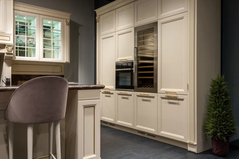
There is a zone in nearly every kitchen and many bathrooms that designers quietly refer to as the most revealing test of a room's overall confidence. It sits above the cabinetry, below the ceiling, and stretches across the full length of whatever wall it occupies. It is neither shelf nor wall in the traditional sense. It belongs to no single surface. And because it resists easy categorization, it is almost universally handled poorly — either stuffed with objects that have no business being there or left to accumulate a fine layer of neglect.
At A Delightful Design, we believe that every plane within a room carries potential. The space above your cabinets is no exception. What it demands is not decoration for its own sake, but a clear and considered decision about what role — if any — it should play in the life of the room.
Why This Space Is So Frequently Mishandled
The trouble with the area above cabinetry is that it exists in a kind of visual no-man's-land. It is too high to be functional in any everyday sense, too prominent to ignore, and just awkward enough in proportion that most homeowners fill it reactively rather than thoughtfully. The result is a familiar tableau: a dusty collection of decorative baskets, oversized ceramic urns, and artificial greenery arranged without clear intention.
This reactive approach stems from a deeply human discomfort with unresolved space. We sense the gap, and we fill it — not because filling it serves the room, but because emptiness feels like an oversight. The first principle of designing this zone well is recognizing that emptiness, when chosen deliberately, is not an oversight at all. It is a design decision.
The Case for Intentional Negative Space
If your kitchen already operates at a high visual frequency — bold tile, intricate hardware, a statement range hood, richly veined countertops — the space above your cabinets may serve the room best by doing nothing. Absolutely nothing.
Negative space is not the absence of design. It is design exercising restraint. A cabinet run that terminates cleanly at the ceiling, or one where the soffit above has been treated to match the wall color so the eye reads it as continuous, communicates a kind of architectural completeness that no collection of objects can replicate. The room breathes. The eye rests. The cabinetry itself becomes the feature, rather than a backdrop for something else.
This approach works especially well in contemporary and transitional kitchens, where clean lines and minimal visual interruption are foundational to the aesthetic. If you are uncertain whether your space calls for objects or openness, the answer is almost always openness.
When Filling the Space Is the Right Answer
There are rooms, however, where a curated arrangement above the cabinets genuinely enriches the whole. Traditional kitchens with crown-molded cabinetry that stops short of the ceiling, farmhouse-style spaces with open upper shelving, and rooms with generous ceiling heights — ten feet or more — are often better served by something placed above than by a long stretch of unaddressed wall.
The operative word is curated. A successful arrangement in this zone shares three qualities: scale, restraint, and coherence.
Scale matters more here than almost anywhere else in a room. Objects that read well at eye level often disappear entirely at cabinet height. Pieces must be larger than instinct suggests — think substantial ceramic vessels, architectural books stacked horizontally, vintage wooden boards, or sculptural objects with strong silhouettes. Small items cluster into visual noise from below.
Restraint means editing aggressively. Three considered objects will almost always outperform seven. Group items in odd numbers if you group at all, and leave meaningful space between groupings so each cluster can breathe independently.
Coherence means that whatever you place above the cabinets should feel like a deliberate extension of the room's existing design language. Linen-toned crockery in a neutral kitchen. Aged brass candlesticks in a warm, traditional space. A row of identically bound antique books in a library-adjacent dining room. The objects should feel found within the room's world, not imported from somewhere else.
Greenery: Handle With Care
Trailing plants and potted greenery are among the most popular choices for the above-cabinet zone, and among the most frequently regretted. The appeal is understandable — organic material softens a hard architectural edge, and trailing vines introduce movement and life. In practice, however, live plants above cabinetry are difficult to water, receive inconsistent light, and tend to look stressed within months of installation.
If greenery is essential to your vision, consider high-quality preserved botanicals — not the artificial silk arrangements of decades past, but the sophisticated dried and preserved specimens now available through specialty retailers. Eucalyptus, pampas, preserved olive branches, and dried allium can hold their form and color for years with no maintenance, and they carry none of the visual desperation of a struggling pothos.
Lighting as the Hidden Variable
One of the most transformative — and least discussed — interventions in this zone is light. The space above cabinetry is an ideal location for concealed LED strip lighting directed upward toward the ceiling. This technique, known as cove lighting when integrated into the architecture, creates a warm ambient wash that makes the ceiling feel lifted and the room feel larger.
Upward-directed lighting above cabinets eliminates the shadow zone that often makes this area feel heavy and unresolved. It also reduces the visual pressure to fill the space with objects, because the light itself becomes the feature. In kitchens where the cabinetry runs to the ceiling, downward-directed under-cabinet lighting performs a similar function at the lower register, bracketing the cabinetry in light and giving the whole run a finished, considered quality.
A Note on Cohesion Across the Room
Whatever decision you make about the space above your cabinetry, it should be made in dialogue with the rest of the room — not in isolation. The palette, materials, and visual weight of anything placed in this zone must answer to the floor, the countertops, the backsplash, and the hardware below. A room reads as elegant when every element feels inevitable, as though it could not have been otherwise. The space above your cabinets is not exempt from that standard.
The most delightful design outcome is not the one that fills every surface or leaves every surface bare. It is the one where every decision — including the decision to leave something empty — has been made with full awareness of its effect on the room as a whole.
That is the discipline this overlooked zone asks of us. And when we rise to meet it, the room invariably rewards the effort.