The Eloquence of Empty: Reconsidering What Bare Walls and Open Space Actually Say About a Room
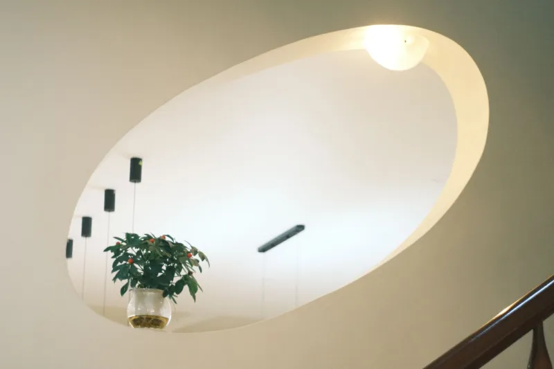
Somewhere along the way, American interior culture developed an anxiety about empty walls. Walk into any home décor retailer, scroll through any design-oriented social feed, and the message is consistent: surfaces are opportunities, and opportunities left unfilled are opportunities wasted. Gallery walls proliferate. Ledges accumulate objects. Mantels grow crowded with layered vignettes. The implicit assumption is that a bare wall is an unfinished one.
This assumption deserves scrutiny — and, frankly, resistance.
The most quietly assured rooms in the canon of great interior design are distinguished not only by what they contain but by what they deliberately do not. The pause between objects. The wall that holds nothing but light. The corner that remains open, allowing the eye to rest before moving on. These are not oversights. They are decisions — and often the most sophisticated ones in the room.
What Fullness Actually Communicates
There is a psychological mechanism at work in the impulse to fill. When a room feels incomplete, the instinct is to add — another piece of art, another plant, another throw pillow arranged with careful casualness. This instinct is understandable. Adding is immediate and gratifying. It produces a visible result. It signals effort.
But effort, it turns out, is not the quality we most admire in a beautifully designed room. What we admire is confidence. And confidence, in interior design as in most things, does not announce itself loudly. It does not need to.
A room crowded to its margins communicates something quite specific: a discomfort with pause, an uncertainty about whether any single element is strong enough to hold attention on its own. The objects compete. The eye has nowhere to settle. What was intended as richness reads instead as restlessness.
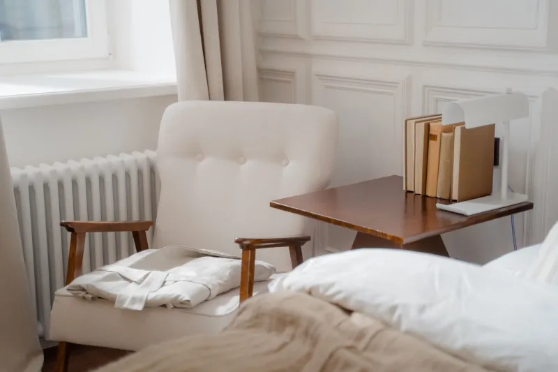
Contrast this with a room that gives its best pieces room to breathe. A single large-scale painting on an otherwise unadorned wall commands attention precisely because nothing around it dilutes it. A console table holding two objects rather than twelve allows each object to be genuinely seen. The space around a thing is not its absence — it is part of its presence.
The Cultural Weight of the Bare Wall
It would be disingenuous to ignore the social dimension of this conversation. In the United States particularly, a certain kind of home — the kind that appears in aspirational media — is often defined by its abundance of curated objects, its layered surfaces, its visual busyness that reads as warmth and personality. The bare wall, in this context, risks being read as poverty of imagination or, worse, poverty of investment.
This is a misreading worth correcting. Restraint is not the same as austerity, and empty space is not the same as emptiness. A room can be deeply warm, deeply personal, and deeply considered while still allowing its walls to breathe. The difference lies in intention. A wall that is bare because nothing has been chosen for it yet feels unresolved. A wall that is bare because the room has been designed around that openness — because the light that falls across it at four in the afternoon is itself the point — feels complete.
Learning to distinguish between these two kinds of empty is one of the more useful skills a homeowner can develop.
Practical Guidance for Resisting the Urge to Add
For those who feel the pull to fill, the following questions are worth asking before any new object is introduced to a space:
Does this room already have a visual anchor? Every room benefits from one element that commands attention — a piece of art, a significant piece of furniture, an architectural feature. Once that anchor is in place, everything added afterward should support it, not compete with it. If the room already has its anchor, ask honestly whether the new addition serves the composition or simply adds to it.
Where does the eye rest now? Stand in the room and notice where your gaze naturally settles. If it moves easily from point to point and arrives somewhere satisfying, the room may already be complete. If the eye wanders without landing, the issue may not be too little — it may be that what is already present is not arranged with enough intention.
Is this addition solving a problem or filling a discomfort? There is a difference between adding something because the room genuinely needs it and adding something because the empty wall makes you uneasy. The second impulse, however understandable, rarely produces a better room. It produces a busier one.
What would the room lose if this were removed? Apply this question not to the proposed addition but to what is already present. Often, the more productive intervention is subtraction rather than addition. Removing two or three objects from a crowded surface can do more for a room's elegance than any new purchase.
Negative Space as Active Design
In the visual arts, negative space is not simply the absence of subject matter. It is a compositional element with as much weight and intention as anything it surrounds. The same principle applies to interior space.
An open stretch of wall adjacent to a carefully chosen piece of art does not diminish the art — it amplifies it. A generous expanse of floor between a sofa and a coffee table does not suggest the room is underfinished — it suggests the room was designed for the experience of moving through it. These are active choices, not passive omissions.
The rooms that feel most effortlessly elegant are those in which every element — including the empty ones — appears to have been considered. Not every wall needs a reason to be bare, but the best bare walls have one: they are making space for something that cannot be purchased or hung. They are making space for the room itself to be felt.
That is not wasted real estate. That is the work.