Color as a Commitment: Choosing a Palette That Serves You for Years, Not Just Seasons
There is a particular kind of design regret that arrives not immediately after a room is finished, but two or three years later — when the color that once felt fresh begins to feel like a costume the house is wearing. The bold terracotta that swept through shelter magazines one autumn, the moody navy that seemed timeless until it suddenly didn't, the blush that aged the room rather than softening it. These are the consequences of choosing color as a trend rather than as a commitment.
At A Delightful Design, we approach color not as decoration but as architecture. A palette, when chosen thoughtfully, becomes the structural language of a home — one that holds steady through furniture changes, seasonal shifts, and the natural evolution of a household's life. The question worth asking before any paint chip is selected is not What color do I love right now? but rather What color will continue to serve this space as my life changes around it?
The Problem With Choosing From Excitement
Excitement is a useful signal, but it is a poor long-term advisor. When we choose a color from a place of enthusiasm — responding to a magazine spread, a neighbor's dining room, or a moment of bold inspiration — we are often choosing the emotion the color evokes in isolation rather than the experience of living with it daily.
Colors that photograph beautifully and colors that sustain a life are not always the same. A room that feels dramatic and alive in a styled image may feel oppressive on a gray January morning when the light is low and the walls seem to close in. Conversely, a color that reads as understated in a showroom may reveal unexpected warmth and depth once surrounded by the textures and materials of a real, inhabited home.
The first discipline of lasting color selection is patience. Before committing to any palette, live with large paint samples — not the small chips, but full twelve-by-twelve swatches applied directly to the wall — for at least two weeks. Observe them at dawn, at midday, under artificial light in the evening, and on overcast days when natural light flattens everything. Color is not a fixed quality; it is a relationship between pigment, light, and perception, and that relationship changes constantly.
Neutrals That Actually Do the Work
The word neutral has suffered from misuse. It has come to suggest something safe, timid, or without personality — a beige that apologizes for itself. But the most enduring rooms in American residential design are built on neutrals that are anything but plain. They are layered, complex, and deeply responsive to their environments.
A true working neutral carries undertones that anchor the room's mood without announcing themselves. Warm whites with faint yellow or pink undertones read as welcoming and luminous without trending toward yellow. Greiges — those nuanced blends of gray and beige — provide a sophisticated backdrop that works equally well with wood tones, metals, and stone. Deep, saturated neutrals like slate, charcoal, and warm black offer dramatic grounding in rooms where confidence is the goal.
The key to selecting neutrals that age gracefully is to choose those that relate to the fixed materials already present in the space. The undertone of your floor, the warmth of your trim, the cool or warm cast of your light fixtures — these are the reference points against which a neutral must be tested. A color that fights its surroundings will always feel slightly wrong, no matter how beautiful it appeared on the chip.
Accent Colors That Evolve Rather Than Expire
Accent colors are where many homeowners take risks they later regret. A deeply saturated accent can be a room's greatest asset or its most stubborn liability, depending on how it is deployed and how well it was chosen.
The most adaptable accent colors are those rooted in the natural world — the muted sage of dried herbs, the aged ochre of old brick, the dusty rose of faded linen. These colors carry the quality of having already lived. They do not shout for attention; they accumulate it slowly. And because they reference the organic world rather than a moment in contemporary color forecasting, they resist obsolescence.
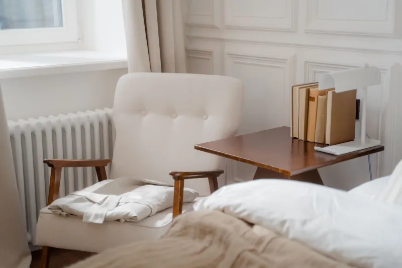
Equally important is where accent color is applied. Paint is the most permanent commitment; textiles, ceramics, and artwork are the most flexible. When introducing a more assertive color into a room, consider placing it first in objects that can be exchanged — a pair of velvet pillows, a ceramic lamp base, a collection of books arranged by hue. This approach allows the palette to shift gracefully over time without requiring a full renovation.
The Relationship Between Light and Longevity
No discussion of color selection is complete without a frank accounting of light — specifically, how the quality and direction of natural light in a given room will shape the experience of any color applied to its walls.
Rooms that face north in the United States receive cooler, more diffuse light throughout the day. Blues, greens, and cool neutrals in these spaces can read as chilly or flat, while warm tones — amber, ivory, terracotta — tend to counteract the light's natural coolness and create a more balanced atmosphere. South-facing rooms receive strong, warm light that can intensify warm colors to the point of overwhelming; cooler tones often perform better here, gaining warmth from the light without tipping into excess.
Seasonal change matters, too. A color that feels perfectly calibrated in summer may read differently in winter, when light enters at a lower angle and the surrounding landscape shifts to gray and brown. Regions with dramatic seasonal variation — the Northeast, the Midwest, the Pacific Northwest — demand particular care in this regard. A palette chosen in the golden light of October may be a very different experience by February.
Building a Palette Rather Than Picking a Color
The most lasting interiors are not built around a single chosen color but around a considered palette — a family of tones that relate to one another with intention and allow for variation and growth. A useful framework involves identifying three layers: a dominant ground color that covers the majority of the room's surfaces, a secondary tone that appears in larger textiles and built-in elements, and an accent that appears sparingly and can be refreshed over time.
When these three layers are chosen for their relationship to one another rather than in isolation, the result is a room that feels coherent and complete — not because every element matches, but because every element belongs. That sense of belonging is what distinguishes a palette that grows with a home from one that simply occupies it.
Color, at its most elegant, is not something you notice. It is something you feel — as warmth, as calm, as the particular quality of light in a room you have loved for years. Choosing well means choosing for that feeling, not for the photograph.