The Considered Collection: A Framework for Displaying Art Without Sacrificing Elegance
There is a particular kind of homeowner who accumulates art the way others accumulate books — compulsively, joyfully, with a conviction that each new acquisition is simply too important to leave in storage. The result, over years of travel, gallery visits, and auction wins, is a collection of genuine personal significance: original paintings, limited-edition prints, photography, ceramics, works on paper, and pieces whose value is measured entirely in memory rather than market price.
And then comes the harder question: how do you live with all of it?
The tension between the art lover's desire to display and the design-minded homeowner's desire for calm, elegant rooms is real — but it is not irresolvable. The discipline that bridges these two impulses is curation. Not the elimination of art, but the thoughtful, intentional selection of what appears where, and how it is presented. Applied with care, this discipline transforms a home from a crowded repository into something closer to a private gallery — a space where each piece is given the conditions it needs to be truly seen.
Start With the Room, Not the Collection
The most common mistake art lovers make when displaying a collection is beginning with the art and working outward. They ask: Where can I hang this piece? The more productive question — and the one a professional designer would ask — is: What does this room need, and which piece in my collection serves that need best?
This is a meaningful reorientation. It positions the room as the primary consideration and the art as a participant in that room's design rather than its governing force. A large-format abstract painting may be the most visually commanding piece in a collection, but if the room that needs a focal point is a quiet bedroom, a smaller, more intimate work may serve the space — and the collection — far better.
Begin by assessing each room independently: its scale, its light, its existing color palette, its emotional register. A kitchen breakfast nook calls for something different than a formal dining room. A home office has different needs than a primary bedroom hallway. Matching the emotional quality of a work to the emotional quality of the space it occupies is one of the most reliable paths to a display that feels cohesive rather than accidental.
The Economics of Restraint
For homeowners working with a meaningful collection but a modest display budget, the most valuable investment is often not in additional frames or hanging hardware but in the discipline to display less. This is, counterintuitively, also the approach that best honors the collection itself.
Museums do not hang every work in their permanent collection simultaneously. They rotate, they select, they create conditions in which each displayed work can be encountered with fresh attention. Homeowners with significant collections would do well to adopt a similar philosophy — rotating works seasonally or annually, storing pieces that are not currently displayed with appropriate care, and resisting the impulse to fill every wall simply because the collection is large enough to do so.
This approach has a practical financial advantage as well: it requires no additional spending. The collection one already owns, displayed with greater selectivity, will produce a more elegant result than a collection three times its size displayed without restraint. Restraint, in this context, is not a concession — it is a curatorial choice, and it is free.
Building a Gallery Wall With Intention
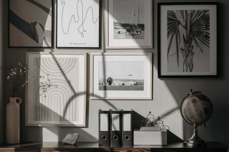
The gallery wall — a grouping of multiple works hung in deliberate proximity — is one of the most popular and most frequently mishandled formats in residential art display. When executed well, it creates a cohesive visual statement that no single work could achieve alone. When executed poorly, it reads as a collection of things that had nowhere else to go.
The difference lies in the organizing principle. Every successful gallery wall has one — whether the homeowner is conscious of it or not. Common organizing principles include:
Consistent framing. A grouping of works in frames of the same color and material (black metal, natural wood, white lacquer) achieves visual unity regardless of the diversity of the works themselves. This is one of the most budget-accessible approaches to a cohesive gallery wall and requires no matching of content, period, or medium.
Consistent subject or palette. Works that share a dominant color family or a common subject — landscapes, portraiture, botanical illustration — will read as a collection rather than an accumulation even when their frames and scales differ.
Consistent scale. A grouping of works that are all approximately the same size, regardless of their content or framing, achieves a grid-like formality that reads as intentional and architectural.
Before a single nail is driven, lay the grouping out on the floor and assess its visual balance. Photograph it from standing height. Adjust until the arrangement feels resolved. Only then transfer it to the wall.
Giving Individual Works Room to Breathe
Not every piece in a collection belongs in a group. Some works — by virtue of their scale, their emotional weight, or their visual complexity — demand to be encountered alone, with sufficient wall space around them to allow the eye to settle and the work to register fully.
As a practical guideline, a significant work hung in isolation should have a minimum of twelve to eighteen inches of empty wall on each side, and should be positioned so that its center falls at approximately fifty-seven inches from the floor — the standard museum hang height, calibrated to average eye level. These are not arbitrary conventions; they reflect centuries of accumulated experience with how human beings encounter art in space.
For a large work on a spacious wall, the temptation to add companion pieces to "fill" the surrounding space should be resisted. The empty wall around a significant piece is not wasted space — it is the visual silence that allows the work to speak.
Art on Every Surface
Display need not be limited to walls. Sculpture, ceramics, and dimensional works on paper deserve surfaces — a console table, a bookshelf, a mantel — where they can be encountered at close range and appreciated in three dimensions. Leaning a framed work against a wall rather than hanging it creates an informal, studio-like quality that suits certain interiors beautifully and requires no commitment or hardware.
A single well-chosen ceramic piece on a kitchen shelf, a sculptural object on a bathroom counter, a framed print leaned against the back of a bookcase — these small deployments of a collection extend its presence throughout the home without concentrating it to the point of visual saturation.
The Living Gallery
The most successful art displays share a quality that is easy to identify and difficult to manufacture: they feel alive. They give the impression that the collection is tended, considered, and genuinely loved — not simply installed and forgotten. This quality is achieved not by spending more but by remaining engaged: rotating works, reconsidering arrangements, allowing the collection to evolve as the homeowner's eye and circumstances evolve.
A home that lives with art in this way is not a static environment but a continuing conversation between the resident and the works they have chosen to surround themselves with. That conversation, conducted with intention and restraint, is one of the most genuine expressions of personal design sensibility that a home can offer.