The Hues That Shape How You Live: A Room-by-Room Guide to Color and Well-Being
There is a particular kind of restlessness that comes from spending time in a room that is painted the wrong color. You may not be able to name it immediately — you simply feel slightly off, mildly agitated, or inexplicably tired. Conversely, a room whose color is precisely right has a quality of ease about it, a sense that everything within it is in its proper place.
This is not coincidence or imagination. It is color psychology at work, and for designers who take the craft seriously, it is one of the most consequential decisions made in any project.
At A Delightful Design, we approach color not as a finishing touch but as a foundational element — one that must be chosen in response to how a space will be used, who will inhabit it, and what emotional register it is meant to sustain. What follows is a room-by-room guide to making those choices with both intention and confidence.
Understanding Why Color Affects Us
Before moving through individual rooms, a brief grounding in the science is useful.
Color perception triggers physiological responses. Research in environmental psychology has consistently shown that cool colors — blues, greens, and certain violets — tend to lower heart rate and reduce cortisol levels, making them conducive to rest and focused concentration. Warm colors — reds, oranges, and saturated yellows — stimulate the nervous system, increase alertness, and can even elevate perceived temperature in a room by several degrees.
Beyond direct physiological effects, color carries deep cultural and associative weight. In the United States, blue is broadly associated with trust and calm; green with nature and renewal; yellow with optimism and energy. These associations are not universal — they shift across cultures and personal histories — which is precisely why a purely prescriptive approach to color selection often fails. The most successful interiors balance psychological principles with the specific context of the people who live in them.
The Kitchen: Appetite, Energy, and Warmth
The kitchen is among the most socially and functionally complex rooms in any home. It is a workspace, a gathering place, and for many American families, the true center of daily life. Color choices here must balance energy and welcome without tipping into overstimulation.
Warm whites and soft creams remain perennially appropriate in kitchens for practical reasons — they reflect light generously, feel clean, and provide a neutral backdrop for the visual complexity of appliances, cabinetry, and countertops. But they need not be the only option.
Sage green has emerged as one of the most versatile kitchen colors of the past decade, and for good reason. It brings the restorative quality of nature indoors without overwhelming a space that already contains significant visual information. Warm terracotta and soft ochre work beautifully in kitchens with natural wood cabinetry, evoking a sense of Mediterranean warmth that encourages lingering.
What to approach with care: high-saturation reds. While red is classically associated with appetite stimulation — a principle exploited liberally in restaurant branding — in a residential kitchen, a saturated red can quickly become fatiguing over the course of a long meal preparation. If red is a beloved color, consider it as an accent in small doses rather than a dominant wall color.
The Bedroom: Rest, Retreat, and Restoration
The bedroom has one primary design imperative above all others: it must support sleep. Every color decision in this room should be evaluated through that lens first.
Cool, muted tones are the most reliably effective choices. Soft blue-grays, dusty lavenders, warm taupes, and sage greens all share a quality of visual quietness that allows the nervous system to begin its evening deceleration. These colors do not demand attention. They simply exist, gently and without insistence.
The most common mistake we encounter in bedroom color consultations is the impulse toward deep, dramatic tones — navy, charcoal, forest green — without accounting for the room's natural light. In a bedroom with generous east- or south-facing windows, a deep navy can be breathtakingly beautiful. In a north-facing room with limited daylight, the same color can feel oppressive and cold, making the space feel smaller and less restorative than it should.
If you are drawn to richness and depth in a bedroom, consider directing that saturation toward a single accent wall — typically the wall behind the headboard — while keeping the remaining three walls in a lighter, complementary tone. This approach delivers visual drama without sacrificing the room's fundamental sense of calm.
The Home Office: Focus, Clarity, and Creative Energy
The proliferation of home offices across American households over the past several years has made this one of the most frequently discussed rooms in our client consultations. Color here must accomplish something nuanced: it must support sustained concentration without becoming monotonous, and it must encourage creative thinking without becoming distracting.
Muted greens and blue-greens are extraordinarily well-suited to office environments. They share the focus-enhancing qualities of cooler palettes while maintaining enough warmth to feel human and habitable over the course of a full workday. A soft eucalyptus or a dusty teal works particularly well in offices that also serve as creative studios.
For those whose work is primarily analytical — finance, writing, detailed technical work — a cooler, more neutral palette may serve better: a warm white with gray undertones, a pale blue-gray, or a soft greige (gray-beige) that reduces visual noise and keeps the mind focused on the task at hand.
One color to use thoughtfully in offices is yellow. While energizing and associated with optimism, high-saturation yellows have been shown in several studies to increase feelings of frustration and anxiety over extended periods. If yellow is meaningful to you, opt for its most muted, honey-toned relatives rather than anything approaching a primary hue.
The Living Room: Conversation, Connection, and Comfort
The living room presents perhaps the most latitude of any space in the home, precisely because its function is the most varied. It must accommodate quiet evenings alone, lively gatherings with friends, and everything in between.
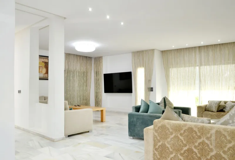
Neutral foundations with layered accents are a reliable framework here. A warm greige, a sophisticated putty, or a complex white (one with undertones of warm gray or blush) on the walls provides a flexible backdrop that can shift in character based on the accessories, textiles, and lighting layered over it. This is a space where accent walls can be used to particular effect — a single wall in a deeper, more saturated tone grounds the room and creates a focal point without locking the entire space into a single emotional register.
A Practical Framework for Testing Before You Commit
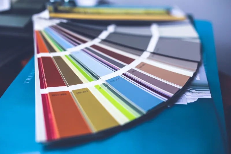
Regardless of the room, the single most valuable step in any color selection process is extended in-situ testing. Paint large swatches — at minimum twelve by twelve inches — directly on the wall and observe them at different times of day and under both natural and artificial light. Colors shift dramatically between morning, afternoon, and evening, and a shade that reads perfectly at noon may appear entirely different at 7 p.m. under warm incandescent light.
We also recommend living with a color swatch for a minimum of one week before committing. What feels exciting and right on the first day may reveal itself as overstimulating or simply incorrect by day five. Patience in this stage of the process is not indecision — it is wisdom.
Finally, consider the transitions between rooms. A home whose color palette shifts abruptly from room to room can feel disjointed and unsettled. Look for the connecting thread in your palette — a shared undertone, a repeated accent color, a consistent value of light and dark — and let that thread guide each room's color story into coherent relationship with the whole.
Color, chosen with care, is among the most deeply personal and profoundly effective tools available in interior design. Used thoughtfully, it does not merely decorate a space — it defines how that space makes you feel every single day you inhabit it.