The Art of Breathing Room: How Empty Space Becomes Your Most Powerful Design Element
In a culture that often equates more with better, the most sophisticated interiors tell a different story. Thoughtfully curated emptiness — what designers call negative space — is quietly one of the most transformative tools in elegant interior design. Understanding the psychology behind it can permanently change the way you see, and inhabit, any room.
What Negative Space Actually Means in Interior Design
The term "negative space" originates in visual art, describing the area surrounding and between subjects in a composition. In interior design, the concept translates seamlessly: it refers to the deliberate, intentional voids within a room — the bare corner left unfurnished, the wide berth of wall between two framed pieces, the generous clearance between a sofa and a coffee table.
Crucially, negative space is not the same as neglect. A room that simply lacks furniture is unfinished. A room where emptiness has been consciously choreographed is refined. The distinction lies entirely in intent, and that distinction is something the human eye — and mind — registers immediately, even if it cannot always articulate why.
The Psychological Principles at Work
Research in environmental psychology consistently demonstrates that spatial density affects human stress levels. Cluttered environments elevate cortisol, the body's primary stress hormone, while open, unobstructed spaces promote a measurable sense of calm and cognitive ease. This is not merely aesthetic preference; it is a physiological response.
When a room offers visual rest — places where the eye can pause without encountering another object competing for attention — the brain interprets the environment as safe, orderly, and controlled. In residential settings across the United States, this translates into spaces that feel genuinely restorative rather than simply decorative. Homeowners often describe well-executed negative space as making a room feel "like a deep breath," and that description is far more accurate than it might initially seem.
There is also a powerful association between emptiness and affluence. Luxury retail environments — from flagship boutiques on Fifth Avenue in New York to high-end showrooms in Beverly Hills — understand intuitively that sparse, generous display communicates exclusivity. The fewer items presented in a space, the more significant each individual item appears. This principle translates directly into residential and commercial interiors: a single sculptural object on a wide console feels more intentional, and therefore more expensive, than a collection of twelve objects crowded together.
Corner Spaces: The Most Underestimated Real Estate in Any Room
If there is one area where negative space principles are most frequently misapplied, it is the room corner. The American instinct — reinforced by decades of furniture retail marketing — is to fill corners. Corner shelving units, floor lamps wedged into angles, decorative trees tucked away at 45 degrees. The result, in most cases, is a room that feels smaller, heavier, and somehow busier than its square footage warrants.
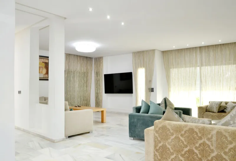
Leaving a corner entirely empty, by contrast, does something counterintuitive and remarkable: it makes the room feel larger. The eye, finding no obstruction, reads the full perimeter of the space. The walls recede. The ceiling appears higher. This is not an optical illusion so much as an accurate perception — the room is fully present, simply no longer concealed behind accumulated objects.
In one residential project completed by our team at A Delightful Design, a narrow living room in a Chicago townhome was transformed not by adding elements but by removing them. Two corner accent tables, a potted plant, and a floor lamp were cleared from the far corners of the room. The furniture arrangement was redistributed toward the center, allowing both corners to breathe. The clients reported that friends and family consistently remarked the room had been "renovated" or "extended" — when in reality, not a single structural change had been made.
Strategic Emptiness in Commercial Spaces
The commercial application of negative space follows the same psychological logic, with the added dimension of brand perception. A boutique hotel lobby in Nashville that our team consulted on presented an interesting challenge: a mid-century building with generous proportions that had been gradually filled over the years with additional seating clusters, decorative consoles, and layered area rugs. The space felt simultaneously grand and chaotic — its architectural merits completely obscured.
The solution was methodical subtraction. Roughly forty percent of the furniture was removed. Remaining pieces were repositioned to create clear sightlines from the entrance to the far window wall. Two statement chairs were placed in deliberate isolation, framed by the empty space around them rather than crowded into a larger grouping. The result elevated the perceived quality of every remaining object and restored the room's inherent architectural dignity.
Guest reviews following the renovation consistently referenced words like "calm," "sophisticated," and "luxurious" — descriptions that had been notably absent from feedback prior to the redesign.
Practical Principles for Incorporating Negative Space at Home
Applying these principles does not require a complete renovation or a significant budget. It requires, primarily, a willingness to edit.
Begin with subtraction, not addition. Before purchasing a single new item for a room that feels unsatisfying, remove one-third of its current contents. Live with the edited version for a week. In the majority of cases, the space will feel more resolved — not less furnished.
Protect your sightlines. Identify the primary view upon entering each room and ensure that sightline remains unobstructed. The eye should be able to travel the full depth of the space without interruption.
Treat corners as punctuation, not storage. A corner can anchor a composition without being filled. A single, well-chosen piece — or nothing at all — is almost always more effective than a cluster of objects attempting to justify the space.
Allow walls to speak. Resist the urge to cover every available wall surface. A room where two walls carry art and two walls are bare will almost always feel more sophisticated than one where all four walls are equally populated.
Consider scale relationships. Negative space amplifies the objects it surrounds. This means those objects must be worthy of amplification. Fewer, better pieces — given room to be seen — will always outperform many mediocre ones pressed together.
The Delightful Paradox of Less
There is something genuinely counterintuitive about the most elegant interiors: they achieve their impact not through accumulation but through restraint. The rooms that feel most luxurious, most calm, most thoroughly considered are, almost without exception, the ones where someone made the disciplined decision to stop adding and start editing.
At A Delightful Design, this philosophy is foundational to every project we undertake. Elegance, in our experience, is rarely about what a room contains. It is about what a room allows — space for the eye to rest, for the mind to quiet, and for the architecture itself to be heard. Empty corners, bare walls, and generous clearances are not signs of an unfinished design. They are, when handled with intention, the most sophisticated design decisions a space can contain.